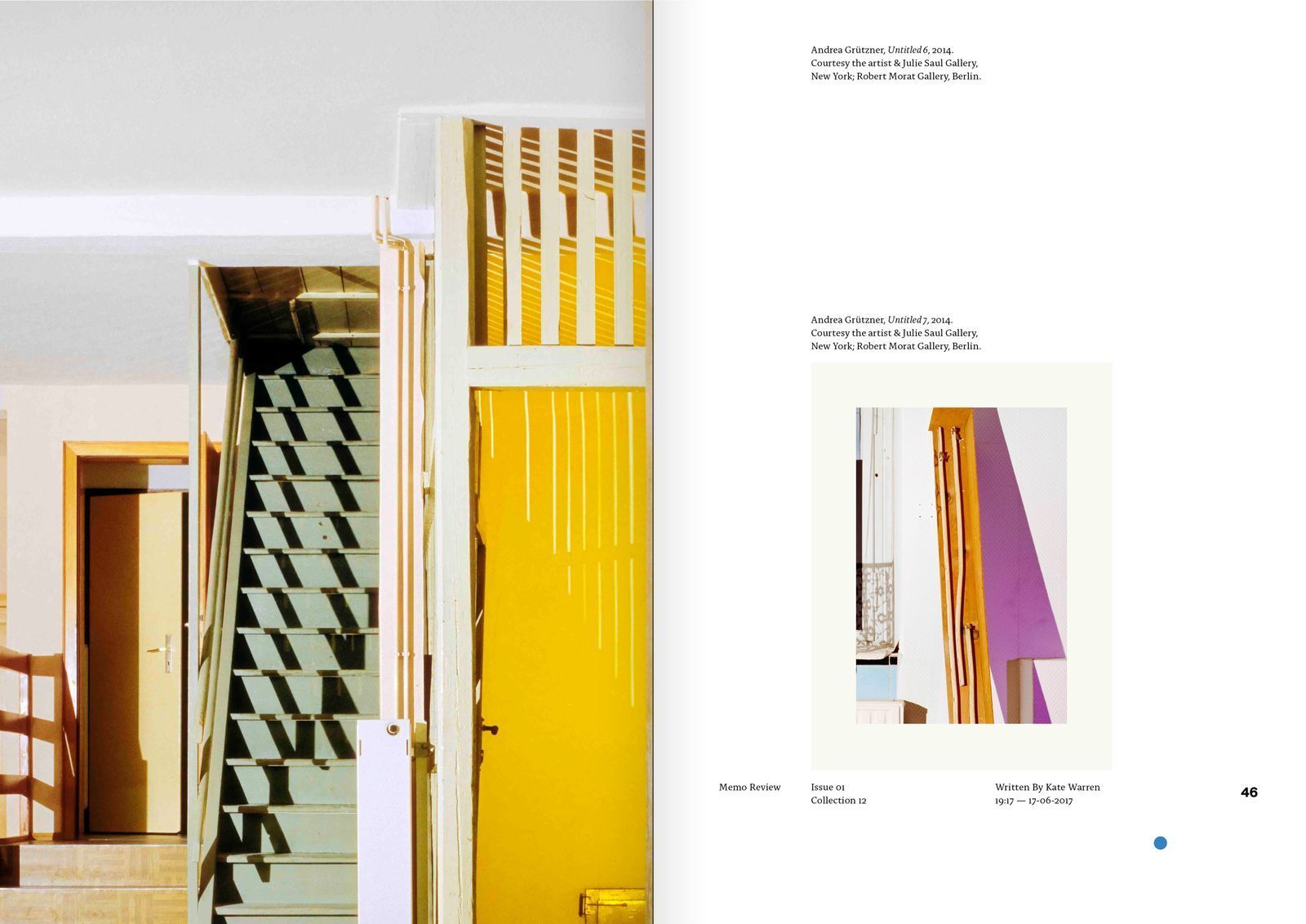
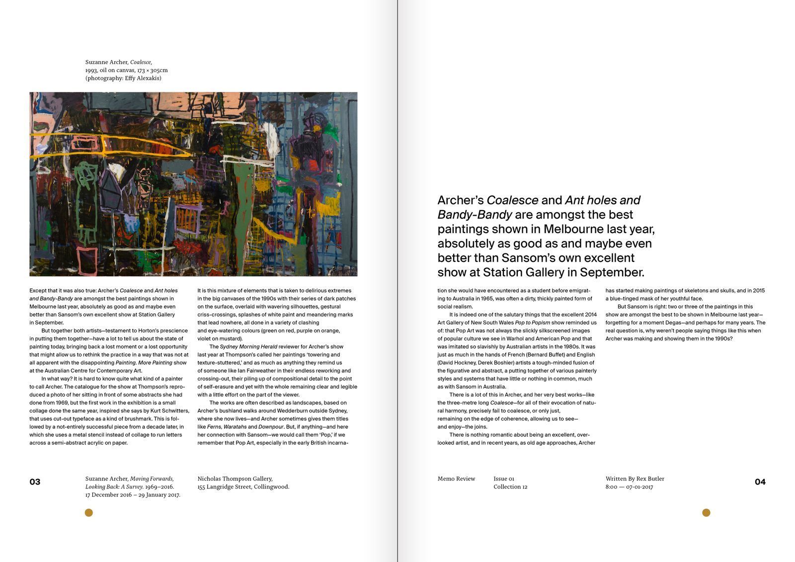
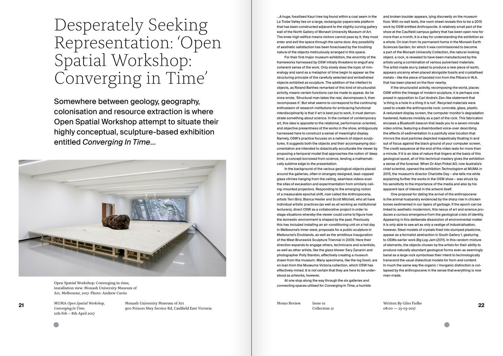
Memo Review
Giving an art publication a recognisable voice without competing with the art.
Premise
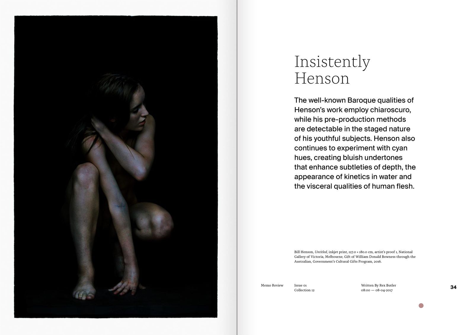
An art periodical needs enough identity to be recognisable, but an expressive graphic layer can compete with the work it exists to present. Removing character entirely would solve one problem by creating another.
Reframe
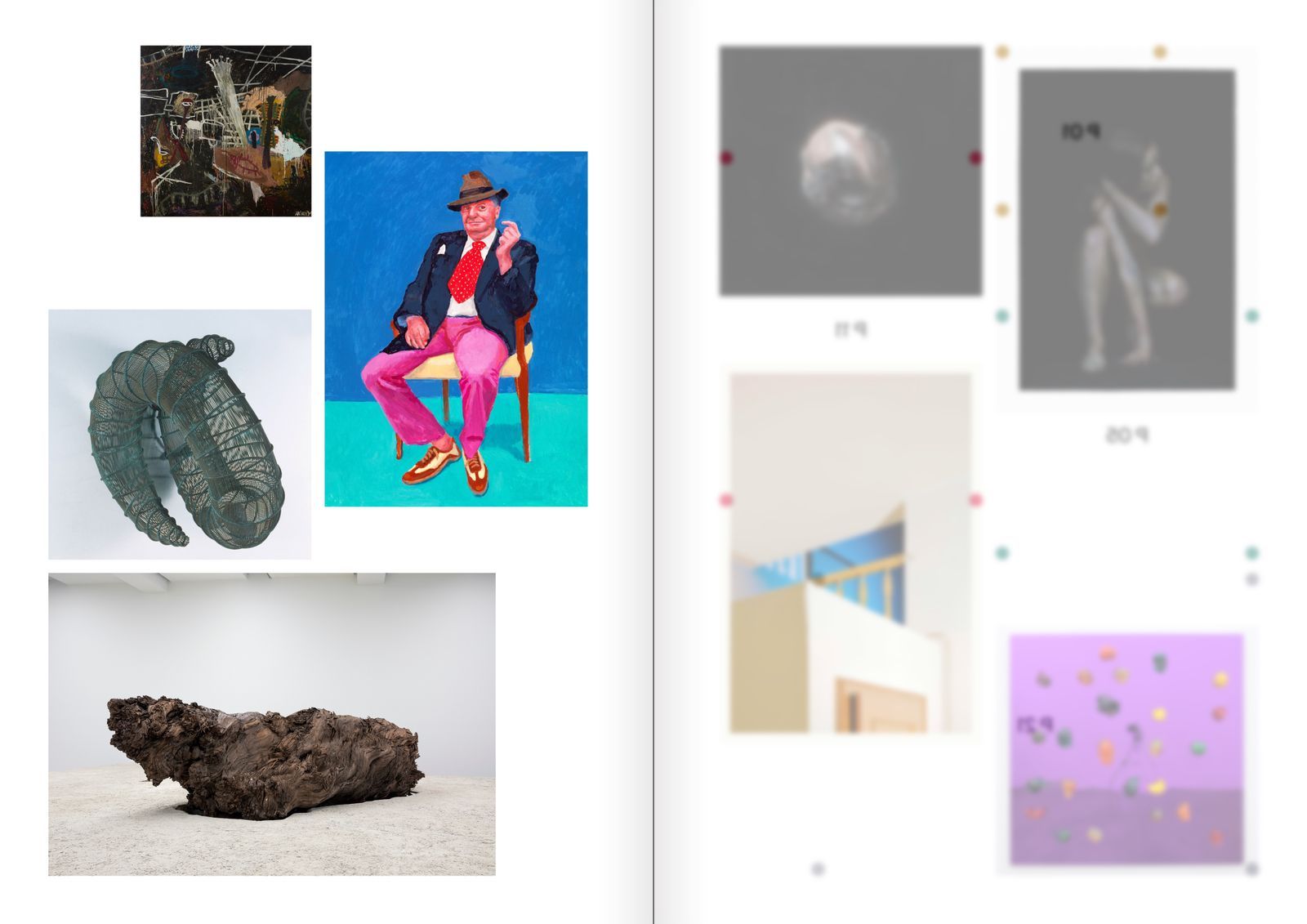
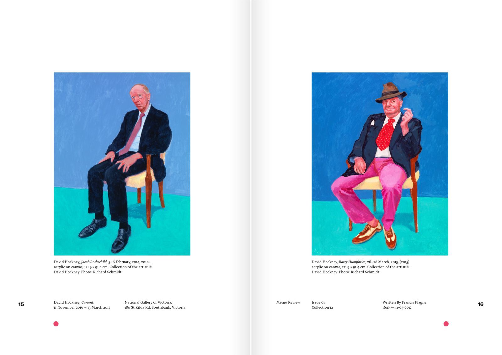
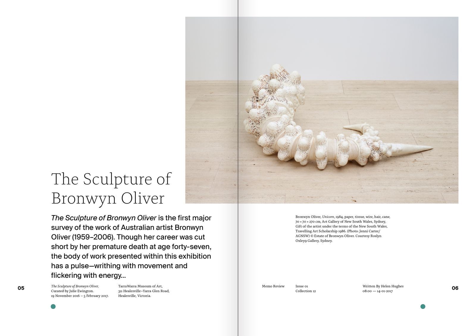
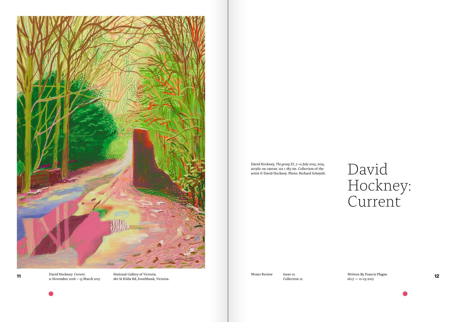
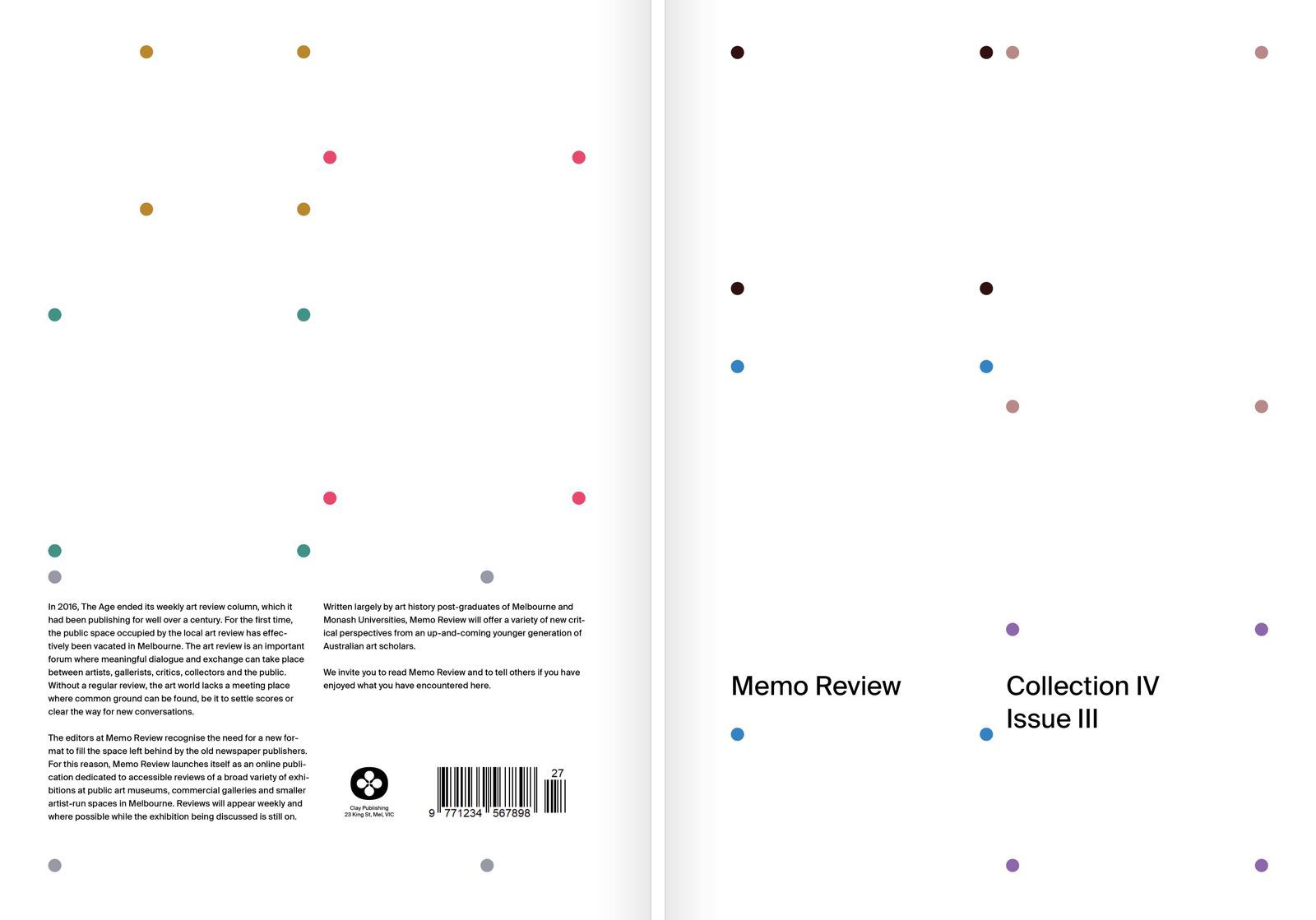
The publication did not need a louder visual signature. It needed to locate its identity in the relationships between content: page rhythm, hierarchy, pacing and controlled shifts in tone.
Strategic direction
Structure carries the identity. The publication becomes distinctive through the way it edits and frames material rather than through a repeated graphic device placed over every contributor.
System
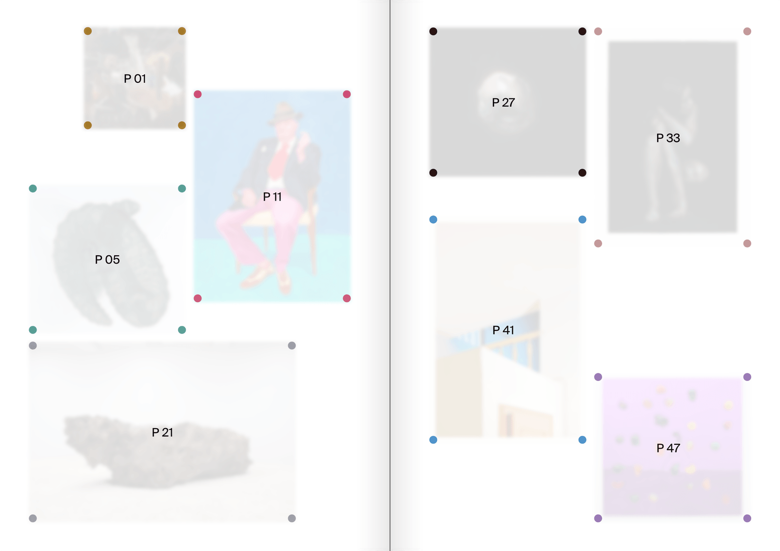
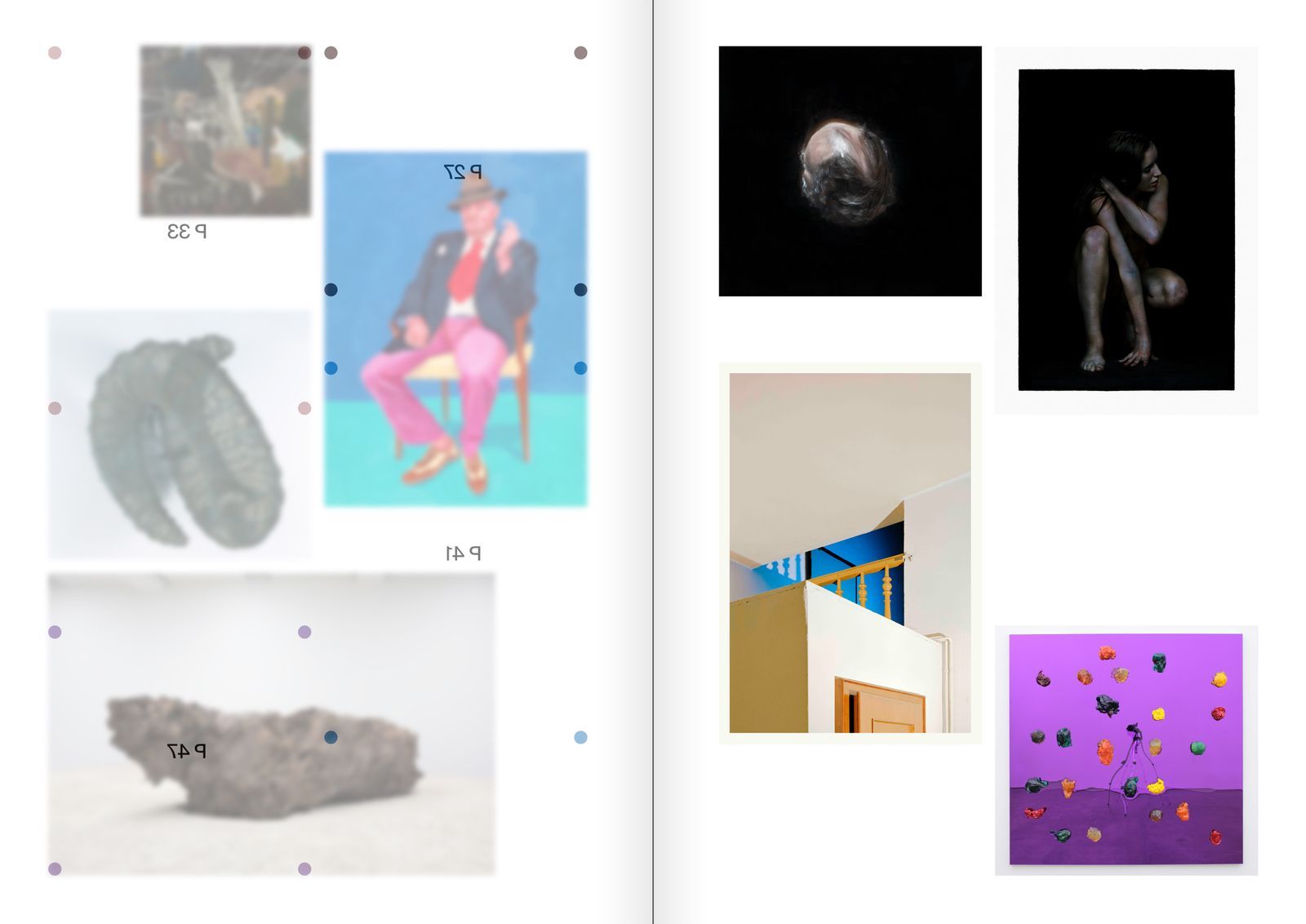
A sparse editorial framework coordinates sections, image pacing, typography and colour while remaining responsive to different bodies of work. Each issue can change with its contributors without losing the editorial judgment that connects it to the publication.
Scope
Editorial concept, art direction, grid system, typography and print detailing.